Tuesday 26 June 2012

Vector Portrait

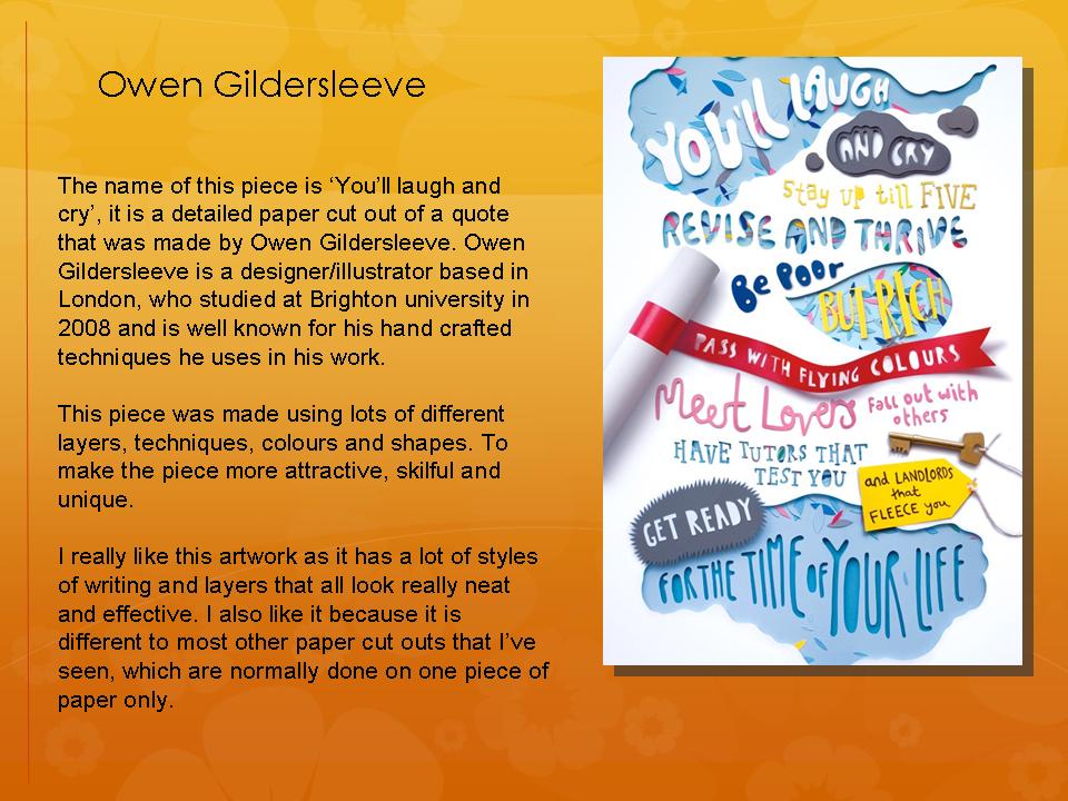
Here are my 2 vector portrait images of Trey Songz:


1. Open an image of artist in Photoshop
2. Add a smart blur to simplify the image.
3. Then posterize the image, changing the number of levels to around 2 or 3.
4. Next open up the image in Illustrator.
5. Create a separate layer for each colour in the image.
6. Choose a layer to work on a lock all the others.
7. Use the pen tool to draw around all the areas of your chosen colour.
8. Repeat this step for each layer/colour.
9. Finally change the fill colour of each layer you have traced over with the pen tool to get this effect.


For this image I used the same technique as the image about but when posterizing the image I used a lot more  levels, so the image is more detailed. Therefore when I created the image in Illustrator i had to use a lot more layers (one for each colour).


Typography Poster


This is my typography style poster of Chris Brown. 

I had to find a close up image of an artist with a fairly plain background to use for this technique. I then had to make some adjustments to it before adding in the rainbow colours. Next I used lyrics from one of my chosen artist's songs which I added into a separate document and made a brush from. Once I had done this I changed the size of the brush and clicked a few times over the image so that it was all covered.

I like this technique but to develop it further I would like the lyrics to make up the face and body of the artist, so that I can delete the background image and still be left with a clear picture of the artist.


Tuesday 19 June 2012

Biro doodle


This is my doodle design in the style of Billie Jean. I chose the song 'Heart Attack' by Trey Songz, I then had to write out some lyrics from the song, do doodles of things to do with the song and I also did some more detailed imagery such as the rose and heart all using a Biro pen.
To improve this piece I could do the doodle on square/graph paper to give a more effective doodle design and to give it a basic background.

Monday 18 June 2012

AS-A2: Billie Jean analysis


This is a print poster, made by Billie Jean, for a Nike shoe advertisement. The name of the piece is 'Bic' after the Bic biro used to draw it. It is part of a poster campaign, in which 30 posters were made for 30 years of Nike basketball shoes. 
The drawings of the basketballs and people playing basketball in the background represent the basketball theme of the shoe. The doodle design contains lots of small images that relate to the product. Such as space invader, pacman and the peace sign that relate to the time of the original trainer and basketball team mascot, shoelaces turning into arms and prints from the shoe sole to represent basketball. The poster also contains bold typography of the shoe name that has a 3D look added to it and a stencil type for the date of the shoe's origin. The piece is drawn onto graph paper, possibly as most doodles are done out of boredom, maybe in a lesson at school. There is a mixture of hyper-realism and surrealism within the image, for example the shoe image looks very realistic where as the drawings/doodles of people are dream like. 
The target audience of this poster is young adults, urban, american style, sportsmen. 
I really like this poster design as it is very abstract, unique and interesting as there is a lot going on, on the page. 


Tuesday 12 June 2012

As-A2 Analysis

These are four different designers that I chose to do an analysis on, I chose them because they all have a different style that I like.