Sydney Opera house- Art installation by Darcy Prendergast & friends
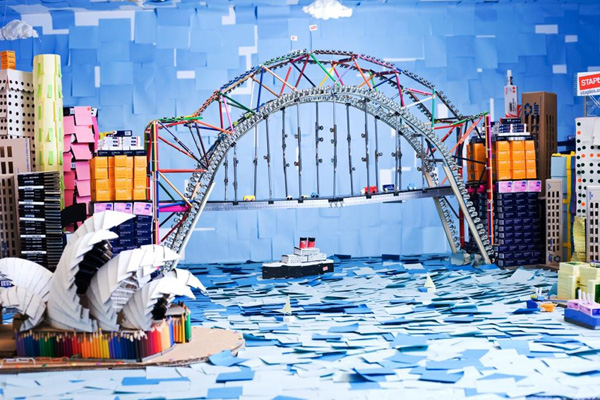
The purpose of this piece is an advertisement for staples and also features a competition at the end. The piece is detailed, 3D, landscape, colourful and original.
The artist has used lots of different bright colours in the installation as he has used various items of stationary to make up the piece, these colours help to make it more attractive and give a happy feel to the piece. The colours of the stationary are used to represent different buildings and objects as well as scenery. For example the blue post it notes symbolize the colour of the river in the installation.
The artist has used lots of different bright colours in the installation as he has used various items of stationary to make up the piece, these colours help to make it more attractive and give a happy feel to the piece. The colours of the stationary are used to represent different buildings and objects as well as scenery. For example the blue post it notes symbolize the colour of the river in the installation.
Materials used: paper, card, cardboard, glue, pencils, pens, tape, rubber bands, post it notes, paper clips, rulers, string, tipex, crayons, marker, pins, clips, foam, double sided tape, coloured pencils, carving knife and scissors.
I like this piece because it is very detailed, skilful and colourful.
No comments:
Post a Comment