Tuesday 26 February 2013

Collage

These are my collages that I created using newspapers and catalogues:


I cut out different pre made letters from a newspaper to make up the word inside. I then cut words out from text in the newspaper and also different colours/textures. Finally for the collage below I cut out different pieces of clothing to then put together and make up the word inside. I didn't like this technique very much as most of them were to simple and boring and I prefer to do handmade typography. 


Monday 25 February 2013

Typography tutorials


For my first experiment I used a very simple/basic technique to get me started. I used different coloured shapes and then used the blend tool to merge the two together, for example a rainbow can be created by having a few basic colours such as blue, green, yellow and red. This is because the blend tool will fill in the gaps with the different shades of colour to make them blend together smoothly. 


To create this effect I created many layers for each letter and then added different effects such as the Gaussian blur and motion blur. I also changed the strength of this for each layer so that some were more blurry than others and I also changed the opacity of the layers. I kept one layer for the top that was a lot clearer than the others to give the text a ghost or kinetic look. 

For this experiment I used different photographs that I made black and white and added a threshold effect onto. I then added the letter I wanted to make above this and used the clipping mask tool to cut the image out into the shape of the letter. Once I created each letter I added them into one document to make up the word outside. 


This technique was fairly simple but looks very powerful. I created one piece of text which I then duplicated the layer of a number of time. Next I added a motion blur effect to each with different strengths soo that some were more stretched/blurred out than others. I then added a new layer above these and created a cloud effect. Finally I changed the colour and blending modes of the layers to find the effect that suited me best.

I like these experiments a lot but I want to try something different for this project as I have used digital techniques for nearly all my work so far in graphics and want to further my handmade skills.

Sunday 24 February 2013

Wednesday 20 February 2013

Layering


To create this layering piece I used a number of different pieces of paper and tracing paper, using felt tip pens, pencils and fine liners to create the typography. I also photocopied some of the typography and changed the size of it so i could then trace over it using tracing paper. Once I had lots of pieces I arranged them in a certain way so that some overlap each other to give this effect. To improve this I could use different coloured pieces of paper for the background layer or different types of paper such as squared or lined. I really enjoyed making this as it was fun to do and I like the effect it has, I would consider this technique for my outcome.

Thursday 14 February 2013

Marcelo Schultz Analysis


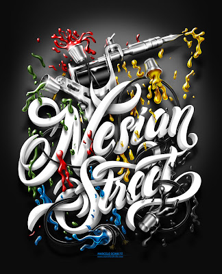
This piece of typography is by Marcelo Shultz a 31 year old graphic designer/illustrator from Brazil. He is currently an Art Director for DDQ Design in Brazil. This is a T-shirt design for the Nesian Street clothing company that aim to inspire all cultures and religions to believe in your dreams. I have chosen to analyse this piece as I find it really inspiring and I have chosen the typography brief for my exam outcome. 
I have looked at his Behance portfolio and his website to find out more about him and what the work was made for. The theme of this work is Tattoo's, the Behance portfolio tells us this but it is also clearly visible in the design as there is a tattoo gun at the top and there are ink splash's across the page. This could represent the company's idea of believing in your dreams as there is so much freedom when choosing a tattoo but once you have it you have to stick with it for the rest of your life.
The artist sketches out the drawings by hand on paper and then scans them in to Photoshop to produce the final outcome by adding colours and detail. He colours the text in white to make it bright so it stands out from the grey background. The ink splashes are coloured in with blue, red, yellow, green and black to add a splash of colour to the typography and make it more fun. The artist has also added a vignette to the design to add to the 3D effect of the typography as the text is lighter and looks as if it has a shadow around it. This makes it jump out from the page and attracts most attention to it. The black ink splash at the bottom blends into this shadow which adds another side to the design. The work is scaled to fit a male T-shirt. At the bottom of the design is the designers name and website in a blue font that matches the ink.
I chose to look at this piece of work as I would love to be able to create something similar. I like the design as it is eye catching and has a good range of colours used. His style of work reminds me a bit of Luke Lucas who creates similar typography using Photoshop/Illustrator. 


These are some more examples of his work:


This is a poster design made for Harley Davidson Motorcycles company.

Thursday 7 February 2013

Wolfgang Weingart Analysis


The designer of the piece of work is Wolfgang Weingart. He was born in 1941 in Germany during World War 2 and is now a well known typographer as he is the creator of Swiss Punk typography. It is unknown what this piece of work was made for, it could possibly be a frame from a video as it looks like ti should be moving. I have chosen to analyse this piece as my brief is to create something similar. 

I have looked at many different websites to help me learn more about the designer and his work. such as http://www.typotheque.com/articles/wolfgang_weingart_typography

He used techniques such as letterpress, film and plate making to create his typography. The artist mainly uses black and white for his work this may be because only black ink was available at the time or because he liked to keep a strong contrast in colours. 

This second piece of his work below is very different as the shapes used to represent the letters are more complex and it is hard to understand what some of them are unlike the standard font used above. This typography is also still and clear where as the other typography that looks like it is spinning around the page. 


At first I found the work quite confusing as it is difficult to understand some of the fonts he uses but after researching it and looking at more examples I grew to like it. I like it because it is unusual and cleverly made. The second piece reminds me of something you would see in a science book. The work has inspired me to try and create something original and complex.

Typography Brief