My chosen brief was on illustration, our task was to create a set of 5 illustrations to give a guide to a place of our choice, with the theme being travel/transport/holidays. At first I chose to create a set of 5 posters for Kenya, but changed it to be set of 3 posters and leaflet to make it more exciting and a challenge. The reason I decided to pick Kenya was because of my trip on safari there that inspired me a lot and I also had lots of photographs to work from, I used these to help give me ideas.
At first I started with 5 possible places to base my illustrations on; New York, Paris, Italy, London and Kenya. After experimenting with some different illustrations from each, creating 3 initial idea sheets on posters, postcards and stamps and looking at the work of other designers, I decided to choose Kenya for my final as it is the most inspiring, its a lot different from other places that would mostly be based on city landmarks and I have been on holiday there myself. From this I also chose to make posters for my final piece. I then experimented with lots of different techniques and illustrations to do with Kenya such as; lino printing with African patterns, city paper installations, paper rubbing/embossing of an elephant, spray painting and many others, to help me narrow down my ideas. Next I made my decision on what illustrations I would use for my final posters, I chose 5 images of different animals (lions, giraffes, a rhino, zebra and elephants) that I then sketched. I then experimented with these drawings with more techniques, such as; zebra spray paint, drawing African patterns into the pictures, using felt tips, paper collage and edits in Photoshop. I also visited the 'Pick me up' exhibition and Hayward gallery in between to give me inspiration to help develop my ideas further. From this experimentation I decided that I wanted to develop my idea in Photoshop for my final piece. Finally the last major change that I made to my work was that I would make 3 posters and a leaflet instead of 5 posters.
At first I started with 5 possible places to base my illustrations on; New York, Paris, Italy, London and Kenya. After experimenting with some different illustrations from each, creating 3 initial idea sheets on posters, postcards and stamps and looking at the work of other designers, I decided to choose Kenya for my final as it is the most inspiring, its a lot different from other places that would mostly be based on city landmarks and I have been on holiday there myself. From this I also chose to make posters for my final piece. I then experimented with lots of different techniques and illustrations to do with Kenya such as; lino printing with African patterns, city paper installations, paper rubbing/embossing of an elephant, spray painting and many others, to help me narrow down my ideas. Next I made my decision on what illustrations I would use for my final posters, I chose 5 images of different animals (lions, giraffes, a rhino, zebra and elephants) that I then sketched. I then experimented with these drawings with more techniques, such as; zebra spray paint, drawing African patterns into the pictures, using felt tips, paper collage and edits in Photoshop. I also visited the 'Pick me up' exhibition and Hayward gallery in between to give me inspiration to help develop my ideas further. From this experimentation I decided that I wanted to develop my idea in Photoshop for my final piece. Finally the last major change that I made to my work was that I would make 3 posters and a leaflet instead of 5 posters.
Danny Alison is my main inspiration for my design but I also got a couple of my ideas from Chris Ede and Miles Donovan. From looking at Danny Alison's work that I really liked a lot made me want to make something similar to it using the same kind of techniques in Photoshop and using different textures in the background. As experimentation I created two different images, one in the style of Chris Ede and the other in the style of Miles Donovan. From doing this I learnt different techniques I could use in Photoshop and gained some extra ideas, such as applying different effects to images and using the threshold to add depth to the image.
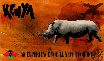
I am very happy with my final poster outcomes as I think they worked how I wanted them to and they look bright and effective. I think the background texture used on the posters and leaflet worked very well as it gave a good effect to the design, its unique, matches with the African theme and the colours used could symbolize the heat of the country. The photographs of animals that I edited in Photoshop using the ideas of different effects that I got from Chris Ede and Miles Donovan's work also worked well as they give a slight handmade painting effect rather than a plain picture cut out. I am not as happy with my final leaflet outcome as the photographs i added into it don't show up that well, as i used the multiply blend which made them look dark.
To improve my posters I would develop the logo and typography of the slogan to make them look more skilfully made and make them stand out better from the rest of the poster. To improve my leaflet i would change the look of the photographs i sued by using a different blend or effect added to them so the colours are more clear and so that they stand out better.
To improve my posters I would develop the logo and typography of the slogan to make them look more skilfully made and make them stand out better from the rest of the poster. To improve my leaflet i would change the look of the photographs i sued by using a different blend or effect added to them so the colours are more clear and so that they stand out better.
Overall I enjoyed using/learning lots of different techniques and materials and learning new skills in Photoshop which I found very useful and will help in future tasks as I have a wider range of skills. I would like to make more posters in the future as I find it fun and there is a lot you can do with them.


