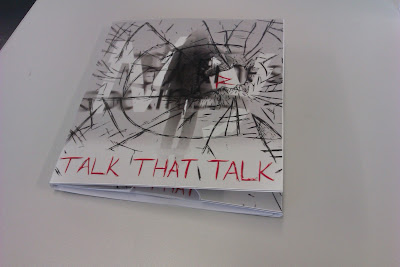
CD packaging closed:
To improve this I would like to add magnets or something to keep it shut.
Back cover:
Front cover opened:
When I constructed the CD case I realized that I had left the inside of the cover empty, which made it look unfinished and plain. So I added in the back cover of the booklet design, as I felt it would fit in well and have a good effect on the work.
Side pulled out:
CD:
When it came to printing out my original CD design it didn't look very effective and I decided I wanted to have a more complex design. So I changed the clipping mask image to the same as the album artwork, but only a small section of it. This is so you can see part of the girls side, the centre of the smashed glass and a bit of the text without it looking the same as the front cover.
CD booklet:
When I printed out my booklet pages and put them all together I found out that it didn't fit into my CD case firstly because it was to wide but also because it was to thick. This meant that I had to adjust the size of the pages on the computer, reprint it and also take some of the pages out so that it would be thin enough to fit in the case.


No comments:
Post a Comment