On this sheet we had to match the logo's with the logo type, this was to help teach us the different type of logo.
Tuesday, 11 September 2012
Thursday, 6 September 2012
The CD Packaging Project
This is the brief for my CD packaging project, the artist I am using is Rihanna and her album 'talk that talk'.
Tuesday, 4 September 2012
Stitching
This is my stitching piece/embroider on paper. I had to first draw my design onto a piece of card in pencil, then using a needle make lots of holes along the lines I drew. Finally I had to thread a piece of cotton through each hole to end up with this effect.
Mixed Media
This is my mixed media piece. I used old stamps to cut out each letter of Rihanna separately, I then used a thick black felt tip pen to do an outline around the word and to write the name of the album. Next I used a piece of string that I stuck onto the paper in a random curvy shape. I then used blue acrylic paint to draw the music notes and make the marks around the piece of paper. Finally I stuck glitter onto the page in lines coming up from the typography and i drew in some little square pixels with Biro to fill up the space.
Monday, 27 August 2012
Stencilling
This is my stencil of a stereo that I cut out on green card:
Once I finished cutting out the stencil I spray painted over it in black.
The image didn't come out very well as not all the piece were connected, so when I sprayed them with the paint they moved. To improve this I would need to make sure all the pieces will stay connected when i cut them out so the image will come out clearly and not have any parts missing.
Sunday, 26 August 2012
Collage
For this collage I printed a picture of Rihanna out from the internet for the top layer. For the background of the collage I cut out lots of different colours, patterns and designs from various magazines, that I built up around the edge of where the picture would lay.
I think this image looks nice, but is very basic and easy to do so I wouldn't want to use it for my work.
Saturday, 25 August 2012
Still Life
This is a photograph of my still life piece, I decided to use red roses to make up a heart shape outline to represent the meaning/theme of my song choices.
I then had to sketch the still life.
Tuesday, 14 August 2012
Papercuts
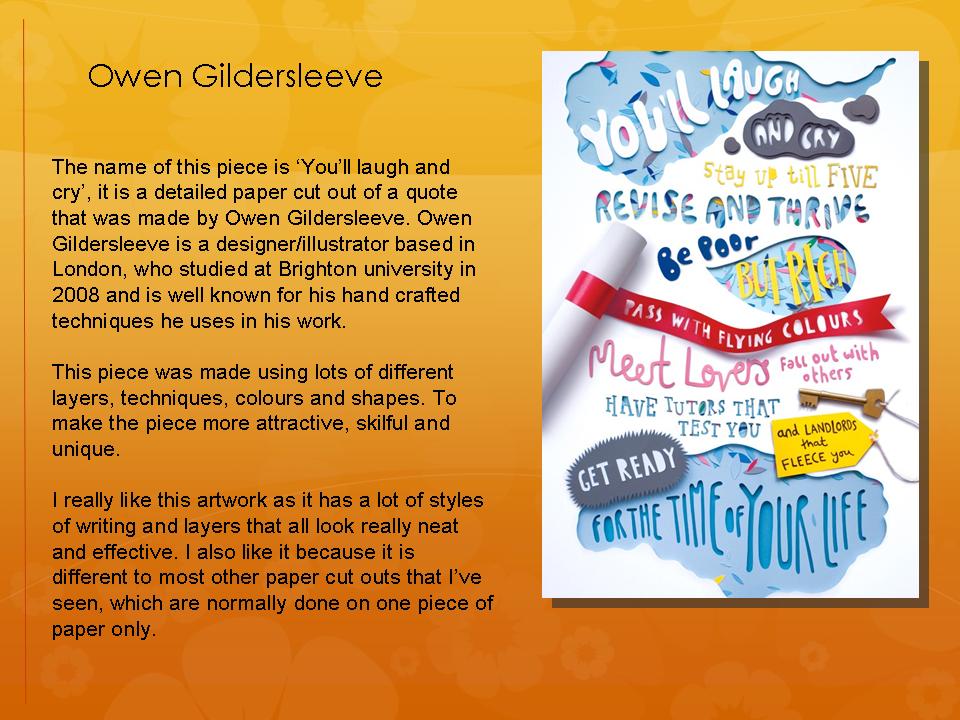
This is my paper cut out in the style of Owen Gildersleeve. I used different layers of different coloured card to cut out the lyrics of the Chris Brown song, 'dont wake me up', using a craft knife. I also tried to use some imagery to represent some of the lyrics in the song.
Typography
This typography piece is in the style of Hennie Haworth. I wrote out different words relating to my song choices, using different materials such as biro, felt tip, crayon, chalk and fine liner in different font styles.
This is my typography piece in the style of Stefan sagmeister. I wrote over the top of a magazine picture of Rihanna in biro pen, using lyrics from her song 'California King Bed'.
Drawing
This is my sketch of Chris Brown, an artist I considered using for my album project.
We also had to draw a picture of an instrument, so I drew my acoustic guitar.
Wednesday, 4 July 2012
Screen Printing
To create this poster design I used two separate images, one of Chris Brown and the other of a rhino. I edited both images separately, by adding some effects such as desaturating and using the smart sharpen tool to get the pix elated look. For the image of Chris Brown I had to erase the head so it would not be visible in the final outcome. In the rhino image I had to erase everything except for the rhino head, so that I could copy it in to the Chris Brown document and put it in place of his head.
I think my final outcome worked better than I expected it to as the rhino head fits quite well onto the body and doesn't look too fake or out of place. However I wouldn't like to develop this idea further as the style wouldn't suit any of my chosen artists..
Monday, 2 July 2012
Papercut
This is my paper cut out in the style of Rob Ryan. I used the title of the Trey Songz album 'Passion, Pain and Pleasure' in the middle and then drew random shapes and made bridges across so when I cut it all out it wouldn't fall apart.
Stencilling
This is my stencil of Trey Songz:
I had trouble creating my stencil as I had to cut out the opposite sections to which I should have, this is because there would be too many loose pieces and it wouldn't be possible to link them all together. I would like to have another go at making a stencil as I was not happy with how this one turned out.
Tuesday, 26 June 2012
Vector Portrait
Here are my 2 vector portrait images of Trey Songz:
1. Open an image of artist in Photoshop
2. Add a smart blur to simplify the image.
3. Then posterize the image, changing the number of levels to around 2 or 3.
4. Next open up the image in Illustrator.
5. Create a separate layer for each colour in the image.
6. Choose a layer to work on a lock all the others.
7. Use the pen tool to draw around all the areas of your chosen colour.
8. Repeat this step for each layer/colour.
9. Finally change the fill colour of each layer you have traced over with the pen tool to get this effect.
For this image I used the same technique as the image about but when posterizing the image I used a lot more levels, so the image is more detailed. Therefore when I created the image in Illustrator i had to use a lot more layers (one for each colour).
Typography Poster
This is my typography style poster of Chris Brown.
I had to find a close up image of an artist with a fairly plain background to use for this technique. I then had to make some adjustments to it before adding in the rainbow colours. Next I used lyrics from one of my chosen artist's songs which I added into a separate document and made a brush from. Once I had done this I changed the size of the brush and clicked a few times over the image so that it was all covered.
I like this technique but to develop it further I would like the lyrics to make up the face and body of the artist, so that I can delete the background image and still be left with a clear picture of the artist.
Wednesday, 20 June 2012
Tuesday, 19 June 2012
Biro doodle
This is my doodle design in the style of Billie Jean. I chose the song 'Heart Attack' by Trey Songz, I then had to write out some lyrics from the song, do doodles of things to do with the song and I also did some more detailed imagery such as the rose and heart all using a Biro pen.
To improve this piece I could do the doodle on square/graph paper to give a more effective doodle design and to give it a basic background.
Monday, 18 June 2012
AS-A2: Billie Jean analysis
This is a print poster, made by Billie Jean, for a Nike shoe advertisement. The name of the piece is 'Bic' after the Bic biro used to draw it. It is part of a poster campaign, in which 30 posters were made for 30 years of Nike basketball shoes.
The drawings of the basketballs and people playing basketball in the background represent the basketball theme of the shoe. The doodle design contains lots of small images that relate to the product. Such as space invader, pacman and the peace sign that relate to the time of the original trainer and basketball team mascot, shoelaces turning into arms and prints from the shoe sole to represent basketball. The poster also contains bold typography of the shoe name that has a 3D look added to it and a stencil type for the date of the shoe's origin. The piece is drawn onto graph paper, possibly as most doodles are done out of boredom, maybe in a lesson at school. There is a mixture of hyper-realism and surrealism within the image, for example the shoe image looks very realistic where as the drawings/doodles of people are dream like.
The target audience of this poster is young adults, urban, american style, sportsmen.
I really like this poster design as it is very abstract, unique and interesting as there is a lot going on, on the page.
Tuesday, 12 June 2012
As-A2 Analysis
These are four different designers that I chose to do an analysis on, I chose them because they all have a different style that I like.
Monday, 11 June 2012
Wednesday, 9 May 2012
Unit 2, Encounters, experiences and meetings: Evaluation
My chosen brief was on illustration, our task was to create a set of 5 illustrations to give a guide to a place of our choice, with the theme being travel/transport/holidays. At first I chose to create a set of 5 posters for Kenya, but changed it to be set of 3 posters and leaflet to make it more exciting and a challenge. The reason I decided to pick Kenya was because of my trip on safari there that inspired me a lot and I also had lots of photographs to work from, I used these to help give me ideas.
At first I started with 5 possible places to base my illustrations on; New York, Paris, Italy, London and Kenya. After experimenting with some different illustrations from each, creating 3 initial idea sheets on posters, postcards and stamps and looking at the work of other designers, I decided to choose Kenya for my final as it is the most inspiring, its a lot different from other places that would mostly be based on city landmarks and I have been on holiday there myself. From this I also chose to make posters for my final piece. I then experimented with lots of different techniques and illustrations to do with Kenya such as; lino printing with African patterns, city paper installations, paper rubbing/embossing of an elephant, spray painting and many others, to help me narrow down my ideas. Next I made my decision on what illustrations I would use for my final posters, I chose 5 images of different animals (lions, giraffes, a rhino, zebra and elephants) that I then sketched. I then experimented with these drawings with more techniques, such as; zebra spray paint, drawing African patterns into the pictures, using felt tips, paper collage and edits in Photoshop. I also visited the 'Pick me up' exhibition and Hayward gallery in between to give me inspiration to help develop my ideas further. From this experimentation I decided that I wanted to develop my idea in Photoshop for my final piece. Finally the last major change that I made to my work was that I would make 3 posters and a leaflet instead of 5 posters.
Danny Alison is my main inspiration for my design but I also got a couple of my ideas from Chris Ede and Miles Donovan. From looking at Danny Alison's work that I really liked a lot made me want to make something similar to it using the same kind of techniques in Photoshop and using different textures in the background. As experimentation I created two different images, one in the style of Chris Ede and the other in the style of Miles Donovan. From doing this I learnt different techniques I could use in Photoshop and gained some extra ideas, such as applying different effects to images and using the threshold to add depth to the image.
I am very happy with my final poster outcomes as I think they worked how I wanted them to and they look bright and effective. I think the background texture used on the posters and leaflet worked very well as it gave a good effect to the design, its unique, matches with the African theme and the colours used could symbolize the heat of the country. The photographs of animals that I edited in Photoshop using the ideas of different effects that I got from Chris Ede and Miles Donovan's work also worked well as they give a slight handmade painting effect rather than a plain picture cut out. I am not as happy with my final leaflet outcome as the photographs i added into it don't show up that well, as i used the multiply blend which made them look dark.
To improve my posters I would develop the logo and typography of the slogan to make them look more skilfully made and make them stand out better from the rest of the poster. To improve my leaflet i would change the look of the photographs i sued by using a different blend or effect added to them so the colours are more clear and so that they stand out better.
Overall I enjoyed using/learning lots of different techniques and materials and learning new skills in Photoshop which I found very useful and will help in future tasks as I have a wider range of skills. I would like to make more posters in the future as I find it fun and there is a lot you can do with them.
Tuesday, 8 May 2012
Unit 2, Encounters, experiences and meetings: Final Posters
How I made these posters:
Layer 1. Plain grey fill.
2. Handmade ink and salt texture background.
3. hue/saturation effect to make the background colours slightly darker but more powerful.
4. Felt tip drawing of Africa that I filled in black and then added the 'soft light' blend to.
5. Handmade patterns drawn in black felt tipwith the 'multiply' blend .
6. Black felt tip drawing of a plane with the 'multiply' blend and the opacity changed to 80%.
7. African symbol drawn in felt tip pen with the 'multiply' blend and the opacity changed down to 70%.
8. Handmade typography, 'Kenya' with the 'multiply' blend.
9. The slogan made using the text tool and the font- Stencil.
10. Picture of the animal (with the background already erased) with the Artistic- Dry brush effect applied to it.
11. Duplicate layer of the animal with the threshold effect applied.
12. Handmade Ink splats added into the background with the 'multiply' blend selected.
13. Black spray paint effect with the 'multiply' blend.
14. The dry brush effect I created by hand with acrylic paint, with the 'multiply' blend.
15. Logo that I created in Illustrator added at the bottom.
Friday, 4 May 2012
Unit 2, Encounters, experiences and meetings: Exam Plan
This is my plan for the exam to help me keep on track and to know what I should be doing, throughout the two days, to make sure that I get everything finished in time. It also includes what materials and mac access I will need to complete my final piece. I have written a list of all the tasks that I will complete for each day giving each an estimated time that it should take.
Thursday, 3 May 2012
Unit 2, Encounters, experiences and meetings: Logo ideas
These are some logo ideas that I have come up with for adding to my posters and leaflet.
My favourite design is the one in the top left corner because it has the Kenyan flag in the background, looks the most effective and stands out from the rest of the ideas. I will develop this by adding in colour and creating it in Illustrator.
Tuesday, 1 May 2012
Unit 2, Encounters, experiences and meetings: Leaflet Development
I developed the leaflet further by creating it in Photoshop, adding in more detail, pictures and texture. The idea of this was to make it match the 3 poster designs so they look similar.
I used the same background textures as from the posters, but added in different pictures and drawings that relate to the information in the leaflet and I also added in some contact details on the back. At the moment I dislike this idea as the pages containing the information are too dark and it is hard to read it or see the images clearly. Also the pages don't look very exciting as the dull colours make it seem boring.
To make this idea better I need to make the colours used brighter and more similar to the ones used on the posters, possibly decrease the opacity of the background layer so it is not so overpowering and add some more colours. I could also add in a logo and slogan to the leaflet to make it seem more realistic/formal as most of the leaflets that I looked at all contain them.
Subscribe to:
Posts (Atom)