Wednesday, 28 March 2012

Unit 2, Encounters, experiences and meetings: 5 Illustration Ideas

These are the 5 illustrations that I want to use on my final posters. I picked out my 5 favourite photographs, of different animals, that I had taken from my trip to Kenya and then sketched them with a pencil.


Friday, 23 March 2012

Unit 2, Encounters, experiences and meetings: Lino printing


This is my drawing of african styled patterns on tracing paper that I will be using for my lino print.
I then turned the tracing paper upside down on top of the lino and drew over the lines again with a pencil so they would print onto the lino.

Next i used the Bench hook to place my piece of lino onto and used the lino cutting tools to cut out my drawing using the faint pencil marks as a guideline. At first I gently cut shallow grooves into my design to make it more neat and less likely for me to make any mistakes. I then went over any lines that would be too shallow to show up when printing the design and also cut some sections out completely.

Once I had finished I used a metal roller to cover my lino with green acrylic paint. I then placed my lino on top of a piece of sugar paper and placed it onto the printing press machine, when I took it out of the machine and pealed of the paper the image had transferred.

I used the same technique for this piece but this time I used orange and red paint on the lino to create this effect.

Characteristics- smooth, durable, bendy, tough, flat, hard, thin, reinforced, you can cut it/carve into it.
Potentials/advantages- you can cut it/carve it, print with it, can emboss with it/do rubbings, reduction printing, tough/sturdy, can be printed on multiple different surfaces, easy for simple designs and big size pieces.

Limitations/disadvantages- mistakes are unreversible, its not 3D, you have to work hard to get texture, quite difficult to cut, limited colour application, hard to clean, its smells, barrier cream for hands, white spirit needed to clean it, long time to dry, time consuming, takes time to get used to it and difficult to cut in detail.

I like this technique because it is unusual and looks effective, but it is also very hard to do without making mistakes. I would possibly like to develop this idea by cutting out pictures of animals into the lino or using this idea within another idea.

Tuesday, 20 March 2012

Unit 2, Encounters, experiences and meetings: Spray paint experiement

This is the stencil for different drawings that I could use for my poster:


I used a sheet of white card to draw them on and then cut them out using a craft knife.

 I then put a piece of paper underneath the stencil and spray painted over it with black spray paint:


I like this technique as it creates a good silhouette of the animals with some blurry edges created by the spray giving it an extra effect. I would like to develop this idea further by trying out more detailed pictures and spraying on to different materials.

Unit 2, encounters, experiences and meetings: Initial ideas

Stamp ideas:
This page is based on ideas that I could use to create a set of different stamps, I based the sheet around America/New York. My main idea is to use the style of Julene Harrison (detailed paper cut outs) to create simple images of New York, such as the statue of liberty, out of paper which I could then possibly spray paint over or leave as they are. I added some images of different stamps from around the world and stuck a few stamps onto the page to help give me inspiration and see what different techniques are used mostly to create stamps. I also drew out three basic/initial ideas for some stamps, including a cartoon styled skyline design, and two sketches of American landmarks.

Postcard ideas:
This sheet is based on ideas for creating a set of  different postcards, I based this on London. I used the artists Hennie Haworth and Zoe More O'Ferrall for inspiration as the images I've chosen to add to the page are based around different cities, including London. They also both mainly use fine liners and pens for there designs to make the detailed images clearer and neater. I added three of my initial ideas that I could use, one based around the London underground map with small drawings of landmarks, another with different landmarks/transport and typography and finally one with a few major landmarks layered up on each other.

Poster ideas:
This sheet is on different ideas for creating a set of posters, I based this on Kenya. My main idea on this sheet is to use a painting styled piece, I got inspiration from Danny Alison and Andy Potts as they both use this technique for most of there work. I added a few sketches of different African animals, transport and village huts that i could use within my final posters. I also added a few pictures of wildlife that I had taken from my trip to Kenya and added some African styled patterns in the background to help give me inspiration.

Wednesday, 14 March 2012

Unit 2:, Encounters, experiences and meetings: Paper relief, rubbings, embossing

These are three different rubbing techniques taken of my paper relief, the first one is graphite on newsprint:

This was my favourite rubbing because the picture came out very clearly and it was easy to do.

Charcoal on cartridge paper:
This was my least favourite as the image isn't as clear and it was more difficult to do because if you pressed to hard or not enough the image wouldn't show up properly.

Oil pastels on tracing paper:
I like this rubbing because it is a nicer colour and the image also came out quite clear.

Wednesday, 7 March 2012

Unit 2, Encounters, experiences and meetings: Primary research visit review

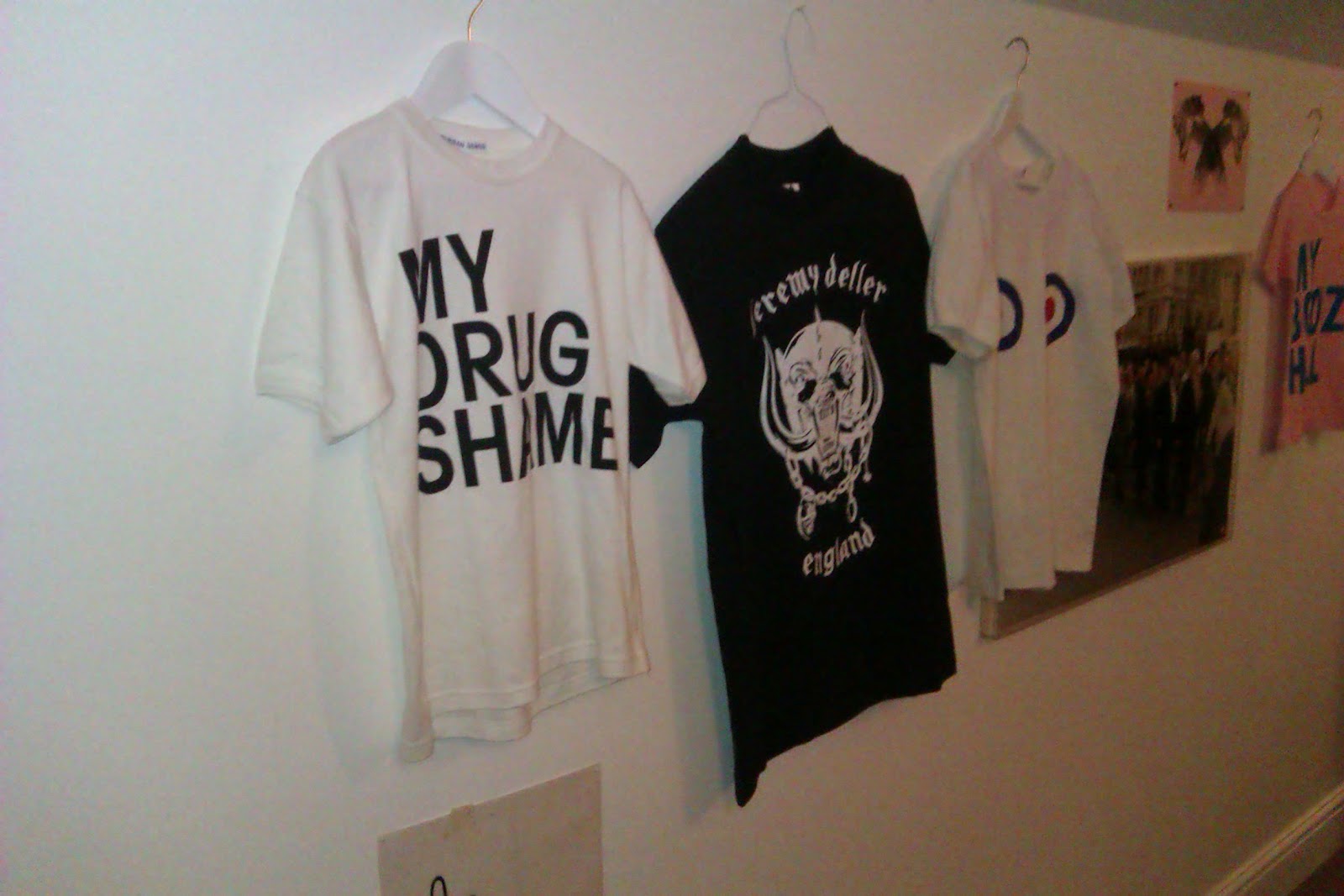
We went to the Hayward Gallery at the London Southbank Centre to look at the Brain Activity Exhibition featuring artists David Shrigley and Jeremy Deller.

About Jeremy Deller: He was born in 1966 in London and studied at The University of London, he also completed an MA in Art History at The University of Sussex. He is an English conceptual, video and installation artist. He is best known for his staged 'Battle of Orgreave' in 200, bringing nearly 1,000 people together in public for a re-enactment of the miners strike from 1984-5.

About David Shrigley: He was born September 1968 in Macclesfield, England and he studied Environmental Art at Glasgow School of Art. He works in various media but is best known for his funny cartoons released in softcover books and on postcards.

These are my two favourite pieces of work:

I like these two pieces of work by David Shrigley because there so simple, random and effective.

These are my two least favourite pieces of work:
I dislike this piece by Jeremy Deller as it is so messy and it doesnt look like he has put much effort into it.

I dislike this piece by David Shrigley as i dont like the style of drawing and it also doesnt look very realistic.

Overall i found the David Shrigley exhibition and drawing along the Southbank part of the trip more enjoyable as i didnt find Jeremy Dellars exhibition as interesting or as good. The trip helped to give me more inspiration and ideas on what to do for my own work.

Unit 2, Encounters, experiences and meetings: Primary research visit


Bez  map and Coffee shop postcard:

My favourite parts of the exhibition:

Views from the South Bank:


Easter egg:

Unit 2, Encounters, experiences and meetings: Trip to London Hayward gallery and South Bank


South Bank:


London Easter egg hunt:

Artwork from Jeremy Dellar's bedroom:


Unit 2, Encounters, experiences and meetings: Paper Installation

First lesson:

Final installation:
We used a wide range of techniques such as drawing images to stick onto the background/ hang from above, scrunched up tissue paper for the sun, bushes and trees, flat sheets of tissue paper to make up the grass and sky, cotton wool for clouds, different types/colours of paper folded to make 3D buildings and some origami.

Parts I made:
I made the bushes, sun, a tree and a few buildings made out of folded graph paper.

This piece below inspired our installation as it has a variety of 3D and 2D parts, hanging pieces and background images.


I like this idea as a lot of detail is needed to make it look good and it is fun to do. I wouldn't want to develop this idea for my final poster though because I don't think it would work as well on a poster and I prefer the idea of doing a 2D drawing piece.

Sunday, 4 March 2012

Unit 2, Encounters, experiences and meetings: Initial paper experiements


These are my first ideas that I came up with for different techniques that you could do with paper. I came up with a spring effect, scrunched up paper, twisted paper, drawing onto the paper, layering it up, a ribbon style piece, folding the paper then cutting into it and reopening it and sticking on random bits of left over paper from the cut out.

Feedback I received about my work: 
Simple yet effective ideas, different to everyone else. Need to stick it all down and do more ideas.

Unit 2, Encounters, experiences and meetings: Paper

Medium: Paper
Characteristics: Thin, smooth, delicate, colourful, flexible, cant stretch it, light, malleable, versatile
Potential: Fold, cut, stick, bend, draw on it, rip it, paper mache, pop up effect
Limitations: You cant rub out pen, put it back together once its been cut, reuse it over and over, stretch it
Advantages: You can recycle it, its malleable, versatile, easy to use
Disadvantages: Delicate, burns easily, comes from trees, can only be reused if its recycled

Tuesday, 28 February 2012

Unit 2, Encounters, experiences and meetings: Analysis


This paper installation is made by Yulia Brodskaya. She was born in Russia but moved to the UK in 2004 where she studied an MA in Graphic Communication at the University of Hertfordshire. She then went on to make lots of paper illustrations for clients all over the world such as Nokia, Starbucks, Orange, Cadbury and many others. 
The art work is made up of lots of different techniques using paper such as folding, cutting, bending and layering. The artist chose to use these material as it is the same style/technique she uses throughout all of her work and is what she's internationally known for. 
I really like this piece because it is so detailed and unusual, it also shows that she has spent lots of time and effort on it.

Unit 2, Encounters, Experiences and Meetings: Analysis

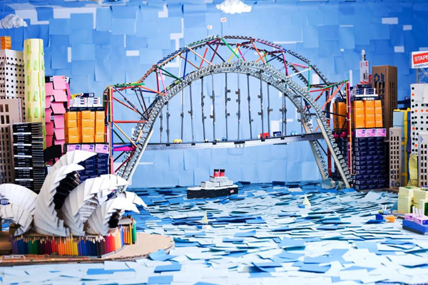
 Sydney Opera house- Art installation by Darcy Prendergast & friends


The purpose of this piece is an advertisement for staples and also features a competition at the end. The piece is detailed, 3D, landscape, colourful and original.
The artist has used lots of different bright colours in the installation as he has used various items of stationary to make up the piece, these colours help to make it more attractive and give a happy feel to the piece. The colours of the stationary are used to represent different buildings and objects as well as scenery. For example the blue post it notes symbolize the colour of the river in the installation.
Materials used: paper, card, cardboard, glue, pencils, pens, tape, rubber bands, post it notes, paper clips, rulers, string, tipex, crayons, marker, pins, clips, foam, double sided tape, coloured pencils, carving knife and scissors.
I like this piece because it is very detailed, skilful and colourful.

Unit 2, Observational Studies

These are my observational studies of different travel objects that were on the table in front of me. we used a range of materials to draw with such as chalk, pens, pencils and fine liners, we also used different coloured paper to draw on.


Here I used a sheet of tracing paper and a fine liner to trace over the front of a passport, an oyster card, underground map and a picture of Buckingham Palace.
These are my own drawings that I had done previously I then chose my favourites and traced over them:

Saturday, 25 February 2012

Sunday, 19 February 2012

Unit 2, Encounters, experiences and meetings: Researching and Recording

After sketching each of the landmarks/interesting visiting points i had to recreate them all using different techniques and materials. For my first idea i used chalk:

Pieces of paper from magazines:

black biro pen:


Typography with a black fine liner:


small crosses with different coloured pens:


Unit 2, Encounters, experiences and meetings: Researching and Recording


I sketched 1 landmark or interesting visiting point for each of my chosen travel destinations. I chose to draw the Leaning Tower of Pisa for Italy, the Eiffel Tower for Paris, Statue of Liberty for New York, an Elephant for Kenya and Big Ben for London.