Friday, 10 February 2012

Unit 2, Encounters, experiences and meetings: Researching and Recording

For this task i collected 5 different images for each of my chosen travel destinations.

New York
Italy
Paris
Kenya
London


Thursday, 9 February 2012

Unit 2, Encounters, Experience and Meetings: Researching and Recording

For this task I had to collect 5 different travel tickets. Here I have a bus pass, two different rail cards, a tram ticket and an air plane ticket.

Unit 2, Encounters, experiences and meetings: Researching and Recording


For the first task i collected 5 different postcards I had received from people or that i had collected myself from various locations (London, Paris, Egypt and Kenya).                                      

Wednesday, 8 February 2012

Unit 2, Encounters, experiences and meetings: Illustration analysis


This piece was made by Andy Potts in 2011 for an illustration competition run by AOI and London Transport museum. Andy Potts is a illustrator/animator from the West Midlands, he graduated from Portsmouth in 1995 with a BA hons degree in illustration. The image is an illustration of what London has to offer. You can tell by looking at the picture that it has been made fairly recently because it is quite a modern piece and shows the modern day London.
The theme of the piece is London transport as the image clearly shows it is all based around this. Andy Potts website helps us to understand more about this image as it tells us what it was made for and where it will be used. The image represents all the different types of transport used around London and also features some landmarks/visiting places in London. The colour of the image could symbolize the colour of water and the was the image is set up could symbolize the flow of water/river. 
Andy Potts has used a variety of different shades of blue for most of the picture to represent the colour of water as the subject of the piece is 'rivers'. The light colours are also very calming/relaxing. Some orange and red has been added into the piece , this could be to make certain parts stand out more or to add a variation of colour to make it more interesting. The image was most likely made using handmade drawings, Adobe Illustrator and photography that has then been edited and layered up in Photoshop. I think Andy Potts chose to use these materials as it would make the image more effective and skilful. The composition is structured so that all the areas flow in to one another like water. There is a sense of movement within the image where the water is splashing out from the back of the boat at the top and also the different coloured lines of blue that flow into each other with the public transport vehicles featured on them. The scale of the image is better bigger so you can see the smaller detail within the bigger picture.
I like the picture as it is unusual, cleverly made and a lot of skill/thought has gone into it. It is quite a calm and happy piece because of the colours that has been used and the shape of the blue lines. The orange sun at the top along with the splash of water draw the most attention as they are bright and different from the style used throughout the rest of the piece.


This painting was made by Danny Allison. Danny Allison is a freelance editorial and advertising illustrator and photographer, he studied at the University of Central Lancashire. This painting is most likely for a poster or advertisement. 
The title of the work is unknown but it has an African theme based around the wildlife. Danny Allison is representing some of the main attractions that Africa has to offer; the big lion, zebra, giraffe and sunset.
The colours used in the picture are very dark and natural colours most likely used to represent the colours of African nature and to match the animal colours. For example the lion in the centre is a mixture of orange, black and white. The silhouette of Africa is in red to symbolize the heat, danger or passion. The dark reddish background along with the orange sun and silhouette of a giraffe in front represent the African sunset. The dark green in the background could symbolize the colour of nature or growth. The picture was made using paints and maybe some chalks and inks. I think the artist chose these materials as they are handmade techniques and also paintings are very popular in African culture because they are a natural resource. The composition is designed so that all the parts relate to each other and create a better picture. He has used texture throughout the whole piece to give it a more natural feel. There is also a lot of colour toning to help blend the colours together and to create a more realistic effect. The zebra featured in the picture have been given a sense of movement to make them look as if they are running away from the lion.
I really like this picture as it is very bold and the colours that are used are very effective. The lion in the centre of the piece draws the most attention as it takes up the majority of the picture.


This is an illustration by Zoe more O'Ferall of landmarks and attractions in London. Zoe More O'Ferall is a london based illustrator that loves drawing with pen, crayon and felt tip. She studied at The University of the Arts London and completed a post graduate course at Central Saint Martins. 
The title of the work is unknown but the theme of the piece is London attractions. 
The artist uses very little colour in the piece, with only black, red and orange being shown. The buildings in the background along with the wall and lamp posts are drawn using black pen. The bus and the underground sign have been coloured in, this is most likely because the subject of the piece is about transport so the artist wanted them to stand out the most. I think the artist chose to use these materials as it is there own style that they use throughout all of there work. It was made using handmade drawings with pen that have been layered up over each other. 
I like this piece as it is different from other drawings, the technique and the colours used are very affect and there is quite a lot of detail go into it.


Unit 2, Encounters, experiences and meetings: My exam Brief


I chose this brief because it looks the most appealing and I would like to improve on my drawing skills. For my research I plan on looking at different cities, locations and other artists posters, pictures etc. The artists/designers i will be looking at are Danny Allison, Hennie Haworth and  Andy Potts. I plan on experimenting with a range of materials/techniques such as pencils, pens, chalk, photography and adobe illustrator/photoshop. The outcome I plan on making will be of 5 different illustrations based on different cities or towns.

Tuesday, 7 February 2012

Unit 2, Encounters, experiences and meetings: Moodboards

These are my moodboards, one for each brief including different pictures about each one. this is to help me choose which brief I want to choose as my final.


Unit 2, Encounters, experiences and meetings: Mindmap

This is my Mindmap about each of the different briefs to help me choose which one I want to do and to give me ideas for what I could do.

Sunday, 22 January 2012

Unit 1, Retail Graphics Project: Evaluation

For this project we had to set up a shop of our choice, choosing what the target audience of the shop will be, type of shop and what the theme will be. We then had to come up with a company name and design a logo, piece of packaging, a swing tag and an animated web advertisement to go with it. 


I chose to put the city scape into the logo as it matches the name of the shop 'Electric City' and the theme of the shot, that is urban. Where as the lightening bolt that features in some of my other logo ideas maybe put across the wrong idea of what the shop is selling. I got the inspiration of adding the city from the city lights image on one of my mood boards. I chose to make the logo fit around the shape of the shop name which had been drawn in between two outwards bending curves. This helps to give the logo a more unique shape compared to other logos. I decided to only add one colour (navy) to my logo to keep it simple and versatile. This is because after researching lots of different logs i realized they were mostly all black and white probably because if they became too complex they would not look as good when adding the logo to other products. Finally I added 'clothing + shoes' along the bottom of the logo to make it clear about what the shop sells. I could improve this font by making it on the computer instead of by hand.


I chose to make an open top box with a slide on cover as its an unusual design compared to other shoe boxes that all seem to have a similar design. It also gives easy access to the shoes inside for the customer to look at. The extra tabs on the box that over lap other more important tabs make it a stronger piece so its less likely to get damaged and will also provide extra protection for the shoes inside. If i had more time i would make the extra tabs have edges that slope inwards slightly and make them slightly shorter than the sides so they would fit more neatly into the box. my inspiration for the shoe box came from the red shoe box/bag shown on my packaging research post.
I decided to add a city across the top side of the box cover so I could cut out windows so the product inside can be seen from the outside. I also made the buildings navy blue to give a strong, bold contrast between the back and front layers on the box. This idea was the most effective compared to my others as it was the most eye catching and stylish. To improve I would re do the windows and cut them out more carefully to make it a better quality. I got the idea of cutting out the windows from the 'Soapworks' box that I did an analysis of.
I added an edited version of my logo to the end of the box where it will be most visible to customers and on the bottom of the cover with the other information about the product. If I had more time i would go back and re edit my logo as the yellow outline is not clearly visible all the way around the words, also the city scape has a double line and overall doesn't look as good as it could. The reason I added the yellow lines was to give it a glowing effect and also to make it stand out from the rest of the box.


I chose this idea over others as it is a more complex with  a more interesting shape and design, compared to the others that have a more common shape. I also liked this design best as the yellow stands out really well from the background and also gives a good effect of light shining through the windows of the layer above. Where as the other designs that weren't as bold or visible on the navy blue background. The reason I chose to use a two layered swing tag was because it would allow more room for information and also it works well with my design. If I had a chance to remake the tag I would make the windows slightly smaller and more the circular hole for the string away from the edge as these parts will easily be ripped. Also I would add more information about the product on the back.

Conclusion: I enjoyed coming up with ideas and designs for this project, as i enjoy clothes shopping in my spare time this was a fun project for me. Overall i felt the project went quite well as i managed to finish all of the work, although if i had more time i would of been able to make more improvements to my final outcomes.

Unit 1, Retail Graphics Project: Animation


This is an animation i created in Adobe Photoshop, using a series of photos I had taken of my box. I decided to show the box opening, turning and then closing. I inserted the images using file-scripts-load files into stack, then i went to window-animation so the animation frames menu opened at the bottom. I then inserted my pictures into the order i wanted them and changed the time delay in between each picture to 0.25 seconds and the amount of times it is played to 'forever'. 

Saturday, 21 January 2012

Unit 1, Retail Graphics Project: Final Swing Tag


For the top layer of my swing tag I added the same texture background as I used on my box. I also added the shop logo along the bottom towards the left so its clearly visible to customers. As the shape of it is a cut out city scape I also decided to cut out the windows of the buildings so that the colours from the layer underneath would show through. For the second layer of the swing tag I used a rectangle shaped piece. I made the background navy blue and added yellow rectangles on top in the same position of the windows on the other piece so when put together the yellow would show through. Along the bottom I added the web address for the shop also in yellow as it shows up well on the blue background. On the back I added the logo at the top again and at the bottom I added the bar code.


Friday, 20 January 2012

Unit 1, Retail Graphics Project: Swing Tag Development

Next I took my four favourite ideas and created them on the computer using illustrator as well as creating some new ideas that I came up with.


I decided to add a second layer to most of my swing tag ideas as it would allow the second layer to contain any information about the product. For one of my new ideas I chose keep it as one piece but give it a fold so it has two layers. The other was the same idea but instead of having a fold I made them two separate pieces.
My least favourite ideas were the one layer rectangle design as it is too simple and quite boring to look at. The second is the two piece city scape design as it is too delicate and wont hold much information on it. Lastly the city scape folded over onto the background as it doesn't stay flat and will be damaged more easily.

I then took my Three final ideas and experimented with printing them out on brown paper. However the coloured ink doesn't show up as well so the effect isn't as good and the colours/material doesn't match well with my shoe box.


I also experimented with using thin white material to make them. For the tag on the left I used a tea bag to stain it a light brown colour and I also added a piece of card behind the tag on the right. 
Since I didn't have the right equipment to be printing on the material I had to draw my designs on by hand which was a lot harder to do and didn't look as good. The design on the left was the hardest because of the city scape being difficult to cut out, therefore the edges of the material are quite messy.


I then chose my favourite idea and developed the surface design of it in Adobe Illustrator.


My least favourite out of these designs was the top right as it is too plain and simple and also the bottom one as the black rings are barely visible on the blue background.

Friday, 13 January 2012

Unit 1, Retail Graphics Project: Initial Swing Tag ideas

These are the first 9 ideas I came up with for my swing tag.


I decided to experiment with a range of different shapes. Simple ones such as rectangular, oval and square that are commonly used on other products and a couple of unique shapes that link to my logo design and theme such as the city scape shape and the shape that matches the one of my logo.
My favourite shapes for the swing tag are the rectangle, oval and city scape.

These were the first ideas I came up with for the shape of my swing tag.


Thursday, 12 January 2012

Unit 1, Graphics Retail Project: Swing Tag Analysis


This is a swing tag made for Tommy Hilfigers clothing shop, it looks like its made for top of the range products therefore the target audience is most likely people with a lot of money to spend and middle aged people. As stated on the round yellow stamp on the front it is an american company. A very small version of the shop logo is featured on the bottom of the tag. Above the logo it says what the product is and what colour in fairly big bold writing so the customer can easily see it. The name of the shop is printed across the middle of the tag in big bold capital letters with a white outline and navy fill. The white outline helps to make it stand out from the background as it gives it a sharp edge so the word looks clearer. The swing tag is made out of brown card with a piece of brown string for attaching it to the product. The hole in the top of the tag has a gold eye lit in it to stop the string from ripping through the card.


The swing tag on the left is made out of black card with two pieces to it. The front piece has a material texture imprinted into the background, possibly because it is for a clothing shop, with an embossed shape/section on the front. The logo and the shop name are featured in the middle of the raised part, to make it stand out better. The second layer of the swing tag is also black card with a black glossy strip printed down the right side which features the shop name and logo. A piece of black and white thread is used through the holes at the top to hold the pieces together and also so it can be attached to the product. The ends of the thread are held together by a piece of plastic for extra strength so they don't come apart as easily. The swing tag looks like it is made for a sports clothing shop with the target audience of teenage boys.

Three

The swing tag is made for another shop that mainly sells jeans. It is made out of thick strong material that has been printed on. The colours used are navy- to symbolize the colour of the jeans and red- to highlight important information. The logo is featured at the top of tag in a sectioned off part from the rest. The main writing in the middle of the tag has a 3D effect with the front of the letters left without any colour. String is put through the hole at the top for attaching it to the product, there is a gold eye lit placed in the hole to strengthen it. The target audience for this shop is most likely all ages, boys or girls as jeans are a very popular product for everyone. 

Tuesday, 10 January 2012

Unit 1, Retail Graphics Project: Swing tags research

I had to carry out some research on existing swing tag designs to help give me inspiration for my own.


Unit 1, Retail Graphics Project: Final Package


For the background of my net I flicked black ink across a piece of paper with a paint brush. I then scanned it in and cropped out certain parts that i wanted to add to each section of my net. For the next layer i added a range of different sized circles/rings varying in black or navy that i had created in Adobe Illustrator. For the final layer i added in my city scape, that i previously made for my logo, across the top part of my net which i filled in navy as well as the side. I also added windows that i cut out with a craft knife once i had printed my net out and mounted it on white card.

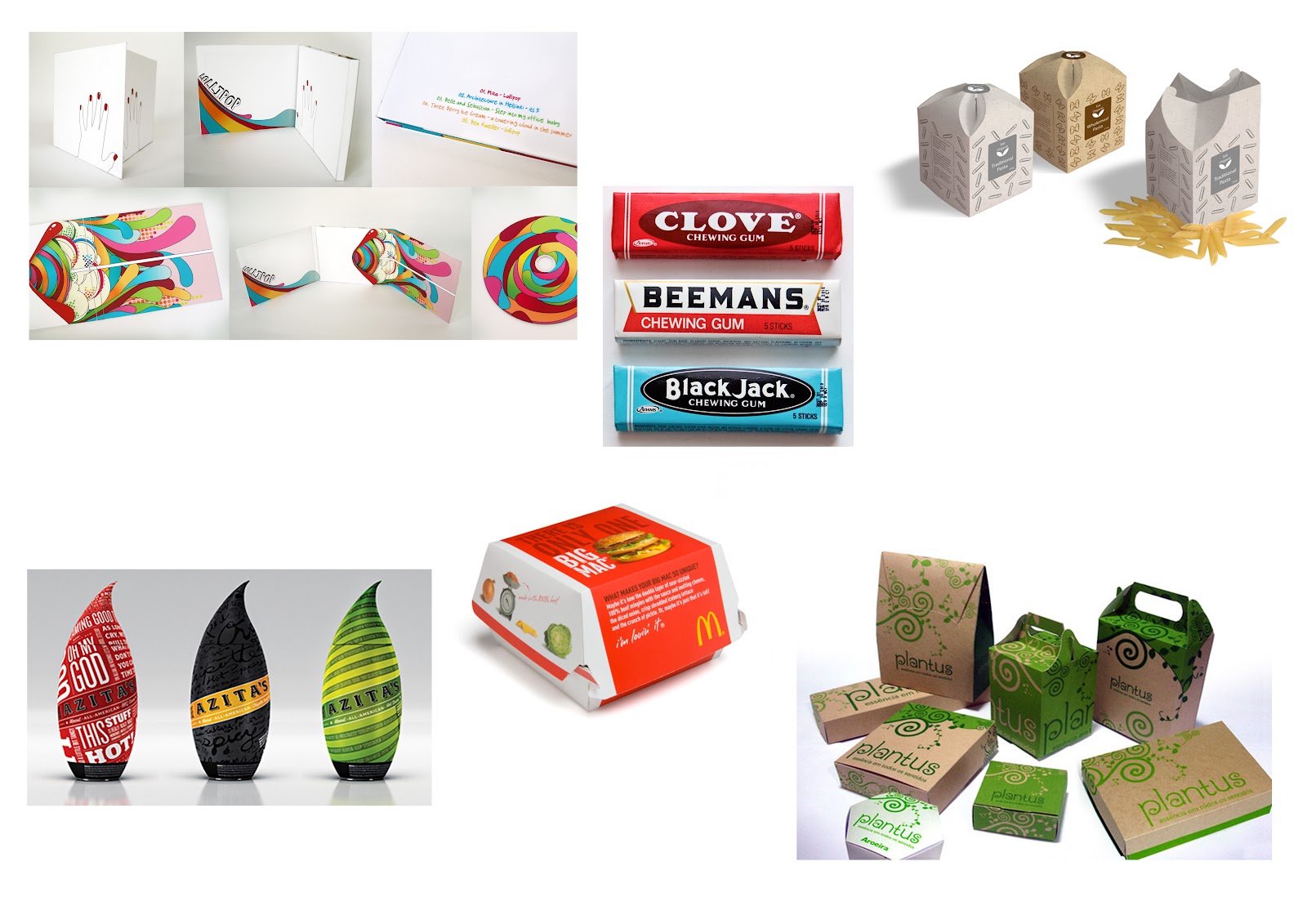
Since the theme of my shop is Urban I decided to type this into Google to help give me inspiration for my box design.

One- The rough look and the paint splashes gave me the inspiration for my textural background to my box.

Two- The look of the circles/rings in the picture inspired me to feature it in my own design.

Three- This shoe box net idea had the biggest impact on my own design, as it is an unusual, clever and unique idea.

The surface design of my box relates to my urban themed clothes shop as urban culture is the way of life in towns and cities and the main feature of my logo/box is a city scape.

I decided to remake my final box so I could make a few changes to improve it. First I needed to make the box cover a few millimetres wider and higher so the main box could slide in and out without any difficulty. I also added some acetate behind the windows I cut out from the top of the box so the product inside will be protected. I drew a picture of a pair of shoes in the inside of the box to show that when the product is inside you will be able to look through and see it.


I also added some information about the product/shop, such as the web address along the side of the box, the size of the product and price on the back. As well as the recycling logo, bar code and another image of the shop logo. This will help promote business for the shop and tell the customer more about the product.


Unit 1, Retail Graphics Project: Package Developments

I used a paint brush to flick black ink across this page so I could add the effect onto the background of my box design.


The box on the right was my first idea that I drew onto the net by hand. I then chose to develop the idea on illustrator, I added in the ink effect to the background and removed the city from the top as it didn't look as good or fit very well. Next I decided to re add the city but going across the box the other way as there is more room to fit it into.


This is the net of my favourite box design.

Unit 1, Retail Graphics Project: Shoe Box Net: Repeat Pattern


I decided to use the lightening bolt from one of my previous logo experiment ideas to make a repeat pattern of in Illustrator. By repeating the edge on one side to the opposite so the edges fit together and then creating a swatch of the pattern so it could be added as a fill.

Wednesday, 4 January 2012

Unit 1, Retail Graphics project: Net Designs


I covered this net in different coloured stamps in a random order and pattern to give it a more effective and unusual look.

For this net i used cut out text from newspapers to give the net an urban, rough look and to make it a typography styled piece.

For this net i used the marble painting technique using only three bold colours to add texture, give a randomized/unique pattern and to add a fun look to the design.

For this net i took rubbings of different coins with different coloured pencils to get a better more detailed effect rather than drawing the coins by hand.

For this net i used charcoal free hand to draw out the basic pattern then used my finger to rub over the lines adding a 3D effect to the design.

For this net i used a black fine liner pen to create an overview map of an urban city, to match my urban theme for my shop.

Tuesday, 3 January 2012

Unit 1, Retail Graphics Project: Initial Packaging Net Ideas

The first net in the top left is a basic box shape with a separate lid that sits on top. The box in the top right is a rectangular shape with the lid attached to the rest of the box. The net in the middle is of a box with a separate cover that slides over the top. Finally the one in the bottom right also has the lid attached to the rest of the box but is more of a square shape and the lid has locking tabs to make it more secure.